App Growth Week · Join us for the 3-day virtual event!
Join for Free

Having a pitch-perfect combination of app screenshots, icon and description is extremely important. If your product page doesn’t resonate with your target users, the chances of achieving stellar conversion shrink to zero, no matter how awesome your app really is.
It is also critical to identify this golden duo of app screenshots and icons before your app is live in the stores. Thus, you are able to make the most of your traffic and seize the opportunities first weeks in the store offer.
Rovio Entertainment was one of SplitMetrics early adopters, the team used it to nail the best possible app screenshots combination before the launch of a new version of their super popular title – Angry Birds 2. We are proud to make our contribution to the game success and want to share the insights into the optimization process.

The Rovio team ran a series of experiments for app screenshots, icons, descriptions, and video previews to discover which combination maximized the number of installs. All ASO specialists will tell you that App Store assets optimization is not a one-iteration process. Growth hackers understand that every assumption should be tested out before making a decision.
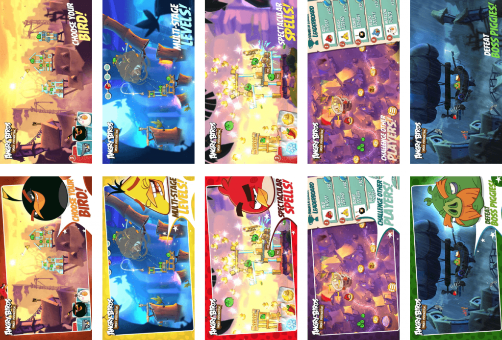
Rovio’s first experiment for an iPhone was designed to test app screenshots landscape (horizontal) orientation. The difference between variations was in displaying the game characters and having a color frame on app screenshots.

The second variation of app screenshots won in this experiment: familiar characters of the game increased the conversion rate.
The next step was testing a new idea: compare vertical app screenshots with horizontal ones. An A/B test with 2 variations was launched.

This app screenshots experiment yielded impressive 99.7% confidence level and demonstrated curious results. Portrait app screenshots did better in terms of conversion which is, to some extent, against the industry standards.
SplitMetrics and Rovio teams came to the conclusion that Angry Birds 2 is not targeted at hardcore gamers that are in constant search for new games and are used to landscape mode of app screenshots.
Angry Birds 2 is mainly played by people who have just one game on their iPhone. Such users are more accustomed to holding their phones in a portrait mode of app screenshots.
If we can improve the app store conversion we actually reduce the load on our marketing team and significantly reduce the budget that we spend on user acquisition.
A series of app screenshots and other experiments produced the assets combination that generated a maximum conversion exceeding others by 13%. It is a sound improvement that meant millions of extra downloads for Angry Birds 2.
Angry Birds 2 got more than 20 million downloads during the first week after its release and SplitMetrics can be credited for at least 2.5 million downloads. For a hit game like that, it is a huge cost cut.
Having appealing app screenshots, icon and description is very important. No matter how great your game is – if your app store page doesn’t appeal to the users, it doesn’t appeal to the people who want to download it. And that’s something we were always aware of but did not have the tools to do it. Now we have SplitMetrics.