App Growth Week · Join us for the 3-day virtual event!
Join for Free

With ever increasing ad costs, harnessing organic traffic and achieving massive App Store presence should be publishers priority. OLBG, the company that creates apps with sports betting tips, is no exception.
Another issue is that the majority of recommended iOS screenshots strategies are applicable to the games category and not betting-related applications. So the OLBG team wanted to test that recommendations with real, targeted audiences before uploading any changed iOS screenshots to the store.
Jess who looks after the marketing at OLBG agreed to share the story behind the optimization of their iOS screenshots with help of A/B testing.
We decided to start our optimization with perfecting our iOS screenshots. It seemed the logical place to start as iOS screenshots are considered to have the biggest impact on the landing page conversion.
Furthermore, we were running Apple Search Ads at the time so iOS screenshots optimization could favor ASA performance as well.
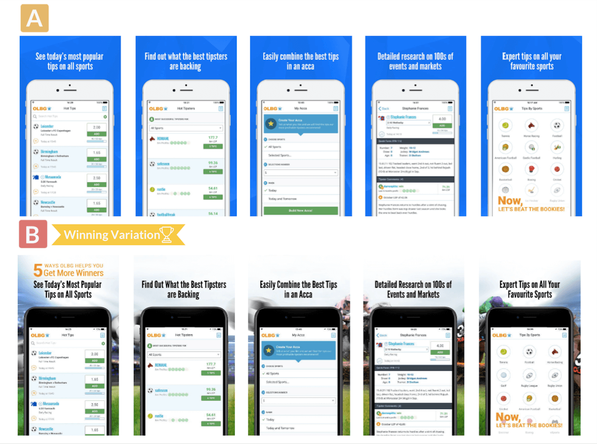
What concerns our initial hypothesis for the first experiment, we decided to check one of iOS screenshots trends. Lots of sources suggest that a plain background converts better than a busy background. Many of our competitors followed this advice and we had a plain background on our Google Play screens.
It was a great idea to test the background of iOS screenshots first as it didn’t require much design time on our side and could have a big impact for minimal change.

To our surprise, the iOS screenshots set with plain background performed 10-13% worse than the one with the themed background. It contradicted the industry trend but we were happy to get this insight into what works for our target audience.
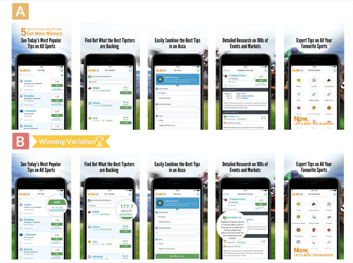
The results of the first test inspired us to keep on experimenting with our iOS screenshots. We decided to play around the interface depicted in the winning iOS screenshots set.

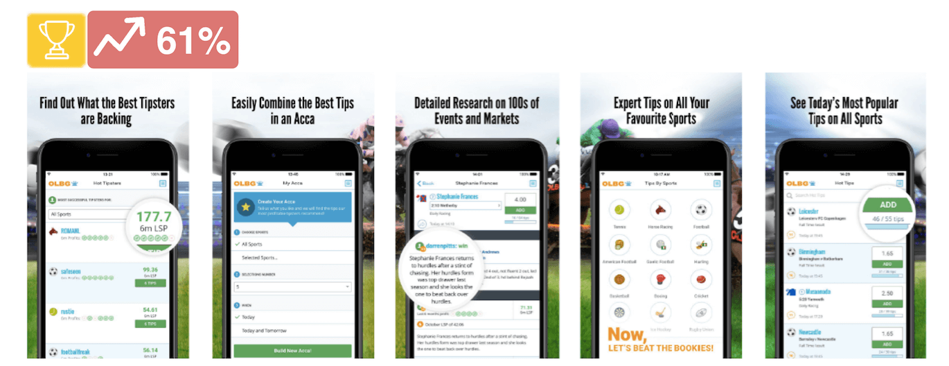
This time, the hypothesis was confirmed with a very convincing 45% improvement. We also learned that people don’t often scroll past the 3rd screen to make their decision. So the first 3 iOS screenshots need to be really impactful and contain your app’s strongest features.
Thanks to experimenting with iOS screenshots design and order we managed to achieve the significant conversion rate increase of 61%.

With A/B testing, you need to be a couple steps ahead with each iOS screenshots test to prepare for the follow-up one. You must wait for confidence level 85%+ as the results can differ significantly in the latter stages.
Before getting down to our experiments, we expected a bit quicker results but soon we learned that A/B testing is a gradual process and each step should be really thought over. Plus, the nature of our industry imposed certain limitations regarding traffic sources which made the process a bit difficult and lengthy at times.
However, those challenges taught us one important lesson:
If you want to succeed in ASO, test, test, and test again.