App Growth Week · Join us for the 3-day virtual event!
Join for Free

App Store and Google Play don’t always agree on things, but this time they unanimously picked Prisma as the app of 2016. MSQRD was also named runner-up for best app of the year for iPhone and a top trending app of 2016 for Android.
What do Prisma and MSQRD have in common (apart from both being photo/video apps, obviously)?
We’re happy and proud to have been part of these great stories and would like to share our chapter with you.
When Prisma’s viral growth started to explode, the team behind the app quickly realized that at this scale even a slight increase in conversion rates will result in millions of additional installs.
Now we’re happy to share some of the successful experiments that we ran as well as the ones that didn’t turn out as we expected.
When we started out, Prisma was already a hit. It was all over the news, so we didn’t want to mess with anything that could hinder app’s recognizability (so icon tests were out of the question).
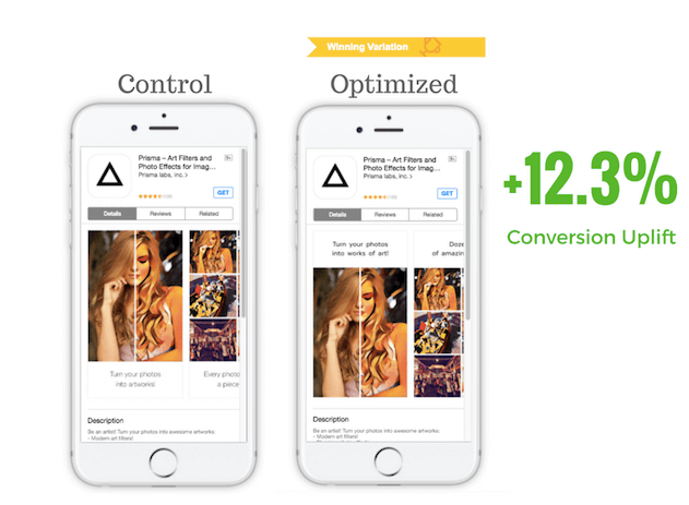
We went after the low-hanging fruit: optimizing the screenshots as they have the biggest impact on conversions. For our first experiment, we chose the low-risk/high-reward strategy: tweaking the screenshots according to the best practices.
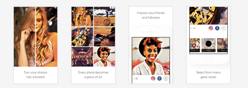

What we did:
The result? The impressive 12.3% uplift in conversion rate for the optimized variation of app store images.
We didn’t sit idly waiting for the results of our first experiment. Instead, we started optimizing Prisma’s description. We tested a number of approaches: opening on a call to action, bullet lists, flashing cool press reviews, bragging about top chart positions, etc.
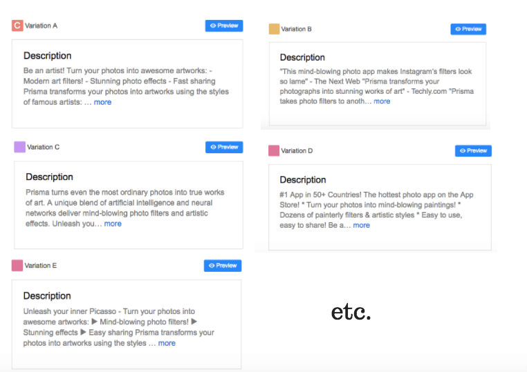
Adding bullet lists and using a prominent call to action both seemed to help conversion rates. However, while we were running the experiment Prisma became App Store Editor’s pick. This also meant that the app now had Editor’s Notes description on top, which moved the regular description way down below the fold, rendering its impact on conversion insignificant.
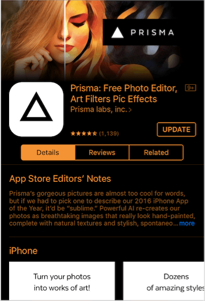
So we decided to stop experimenting with the description. However, we don’t recommend following these footsteps unless you have Editor’s Notes. So, we shifted our focus back to app store images.
For those unfamiliar with how SplitMetrics A/B Testing platform works: it creates web pages emulating the App Store where you can change and edit any element of the page (screenshots, icons, etc.). You then drive traffic to these pages (usually from ad networks, cross promo or your website) to see what works and what doesn’t.
When running our first experiment for Prisma, we decided to kill two birds with one stone. We were running Facebook ads to fuel the experiments, so we first created a set of different banners with different app store images and ran them against each other to:
Given the nature of the app, we were particularly interested in 2 things: which images to feature and which Prisma filters to apply to them. So we created a set of app store images depicting people and also some inanimate objects. Then we processed them with the most popular Prisma filters.
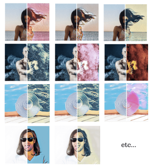
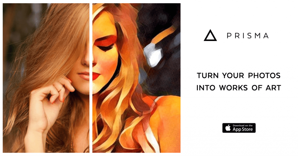
After that, we launched a series of Facebook app install ads for Prisma featuring these app store images as banners to shortlist those that perform best. We also made sure to throw in the girl from the first screenshot into the mix to use it as a performance benchmark.
We targeted the ads at users broadly interested in photography, selfies, photo apps and art to get faster results and better conversion rates. Yet, we didn’t want our targeting to be too narrow since Prisma is really a mass market app.
Once we had our short list of the better performing app store images, it was time to see how they behaved as screenshot creatives. We set up a split test with 4 different variations:
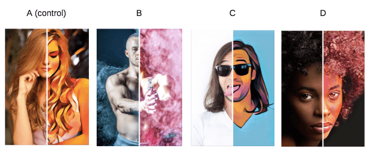
However, it turned out that none of the contending app store images seemed to be beating the control by any significant margin. The Variation C was performing only slightly better, but we decided that the difference wasn’t enough to take action on it.
So even though we didn’t beat the control in this experiment, it was still a success for a number of reasons:
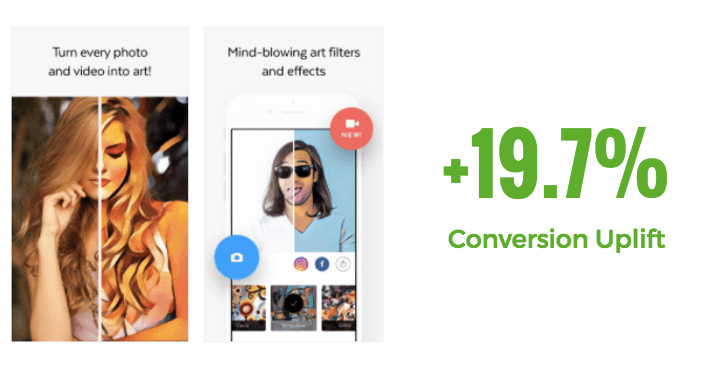
As Prisma team was getting ready for a major update – introducing video filtering, we were tasked with reflecting this in the new screenshot. It was a big deal and we needed to draw attention to the new feature within app store images. And we had just the guy for the job.
Remember this fella?
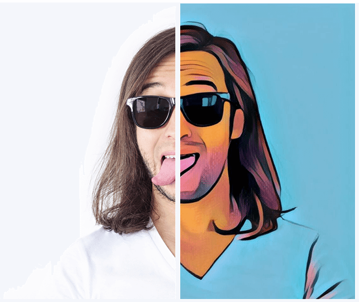
This guy performed really well both in the split test (even though he didn’t win) and as a Facebook banner so we decided to give it another shot and placed it in the second screenshot. We also added symbols for photo and video to convey the idea of the update and altered the first caption to say ‘Turn every photo and video into art’.
The above-mentioned update resulted in the incredible 19.7% increase in the conversion rate.
The case of Prisma teaches us important lessons:
And always, always repurpose things that work: Have a really great performing banner? – See how it performs in app store images, in-app purchase dialogues, etc.
Did the latest subject line of your newsletter score amazing open rates? – Try it as an app description, caption of app store images, or banner text. And naturally, run A/B tests to check your assumptions
SplitMetrics will always be happy to help you get your app on the ‘Best of the Year’ list.