App Growth Week · Join us for the 3-day virtual event!
Join for Free

When you get down to store optimization via split-testing, there is one thing you should remember. The fact is not all app A/B experiments show a boost in-app conversions.
Other two types of results app developers often get from mobile A/B testing within app store optimization are:
App developers interpret zero-results as lack of app A/B testing benefits for them. Yet, the reality is that if a hypothesis works worse or shows no difference, A/B testing allows you to see it on time and save money you would spend if changes in the live version of the app page were implemented.
Mallzee is the UK’s top non-retailer shopping app for iOS and Android, helping users quickly find and buy clothes from 100s of high street brands. After overwhelming user growth in 2016, Q1 2017 at Mallzee was about further refining each area of their marketing strategy.
With good organic visibility and very strong paid acquisition channels, they identified store optimization of conversion as a key area of focus that would impact across acquisition strategy.
Rachelle Garnham, a digital marketing manager at Mallzee, shares their case study on getting valuable audience behavior insights after running a series of tests with negative results.
We formed a thorough plan for our tests, ensuring the changes were minimal to allow a clear impact to be understood and an expectation of iterating and adapting our plan after each result. We’ve tested multiple areas from screenshots to description, icon, and titles.
For our experiments, we have chosen SplitMetrics platform as it allowed us to build the tests very quickly and iterate on our results. It made our store optimization efforts easier.
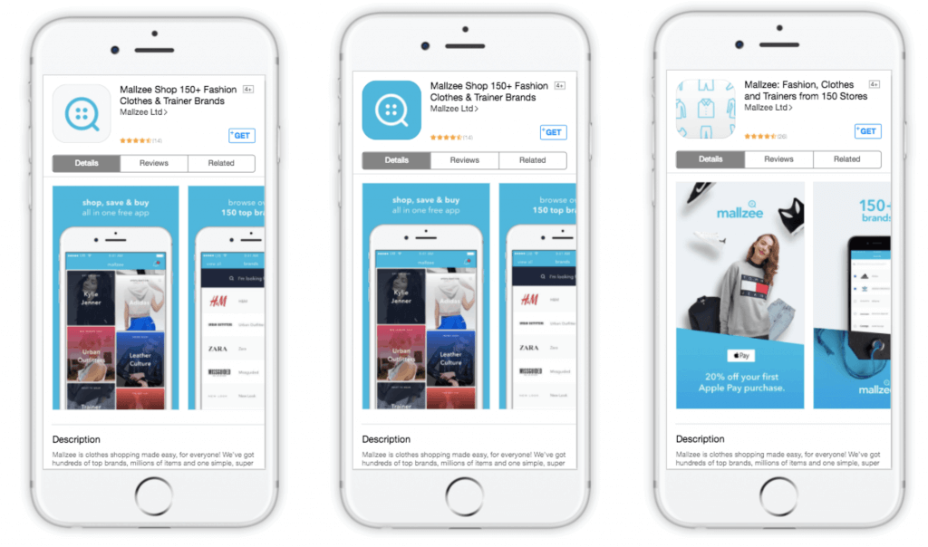
Our icon tests have been particularly interesting. We inverted the colors of our logo for a more vibrant and appealing look, assuming that this would improve conversion.
Did we see the results we expected? In fact, this variation was 14% less effective than the original. Quite a significant difference on such a small change.
Similarly, we trialed a more fashion-focused icon within our store optimization plan. This time the original proved itself to be 28% more effective.
If not for app store optimization, this type of change would previously have been made without testing. Assuming that it wouldn’t have such an impact, we would have lost valuable conversions to download.

This taught us the importance of testing any assumptions before implementing them live on the App Store.
We were keen to implement new app store optimization options, and so we also tested title ideas. However, the two title options that fitted our store optimization plans were not that effective. Once again we saw a 25% and 17.5% lower effectiveness compared to the existing text.
Whilst we’ve run some tests that had no significant winner, we now test all App Store changes as standard. We are constantly working to improve our overall conversion via store optimization.
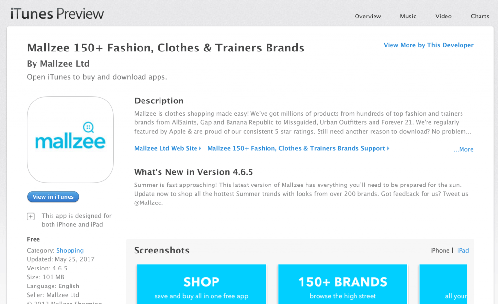
We ultimately iterated through enough versions to find success with our brand name logo which is now live on the App Store and has improved conversion by 10%.

It’s highly important to prepare yourself for one important store optimization truth – your assumptions will usually be wrong! It’s important to test and not assume that your opinion will extend across your entire potential user base.
Small changes can have a big impact. Even if you think a change isn’t significant enough to test within your store optimization strategy, it could have a substantial impact on conversion. You don’t want to make that mistake live on the App Store if you have 1000s of impressions to be impacted every day.
Don’t make your App Store decisions based entirely on branding rules. You, of course, want to keep your branding consistent but when small design changes can help convert users, it’s very important to be flexible. It can even inform wider design decisions away from the App Store.
When you get down to store optimization, remember to test individual changes independently and thoroughly so you know exactly what change has had an impact.