Top Valentine’s Day App Icons for Iphone in 2023
 Anastasiya Starovoytova
  Anastasiya Starovoytova
 Time to let the cat out of the bag: are you ready to celebrate Valentine’s Day?
For app marketers, this question has a double meaning. We have to book a nice restaurant, plan a romantic getaway, AND create Valentine’s Day app icons to steal users’ hearts. And the sooner we do that, the better.
Here comes the problem: unlike Christmas and Halloween, Saint Valentine’s day has fewer options in terms of a color palette and holiday symbols. You have to try twice as hard to see your app grace your target user’s iPhone home screen as it’s hard to stand out in the sea of hearts and roses.
In this article, we’re going to do just that — learn how to stand out.
After all, there are amazing examples of app icons that were created, edited, and customized in such a way that it’s impossible to not fall in love with them. All of them belong to different app categories — Entertainment, Photo & Video, Live Wallpapers, Lifestyle, Games, and others. Their creators know the importance of seasonality as well as that Valentine’s Day sells across many verticals — and this knowledge helped them succeed.
So, here’s our selection of the best Valentine’s Day icon designs so far. Read, get inspired, and prepare to A/B test new ideas!
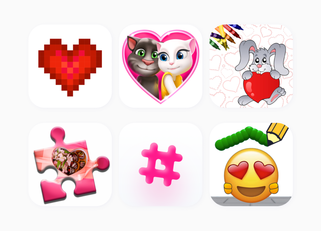
The first collection of app icons is all about using white for a background color.

It may seem plain at first, but white app icons look polished and refined, with the designs opting for minimalism. This style allows you to highlight your main characters (if you’re in the mobile gaming industry) or focus on a single detail that sets your app apart from the others.
If you think about the color theory for a second, you’ll remember what white exactly means for Saint Valentine’s Day — it symbolizes purity and eternal love. A white background also enables you to couple it with other traditional Valentine’s Day colors, such as red and pink.
However, you should be really careful when picking white as the main color for your app icon, especially if you target the Asian market. Many Eastern countries perceive white as a symbol of loss and mourning, this is why we recommend running A/B tests for every sketch first or picking another dominant color to showcase your app on the App Store.
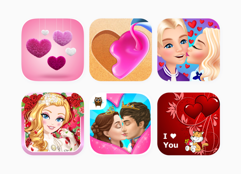
Pink isn’t just a color. It’s an attitude — which is perfect for this celebration of love.
A literal blend of red and white, pink is one of the most popular choices for Valentine’s day app icons. Different shades of pink can evoke many emotions, from passion to a soft kind of affection and playfulness. It’s one of the best choices to ‘flirt’ with your audience and send the right Valentine’s message.
You can also ask your designer to combine pink with other sought-after colors and create a fascinating image users will enjoy.
As you can see from the collection of pink icons above, ASO managers tend to use it for both the background and main element. Hearts, happy couples, and a dreamy expression on your game characters’ faces go well with this color.
Here’s one more idea to think about. To celebrate Valentine’s Day in a unique way, you can try out the newest color of the year, Viva Magenta 18-750. Pantone describes it as an unconventional shade for an unconventional time and views it as a rebellious color. Viva Magenta fits into the Valentine’s Day palette and can help you create a bold icon that will increase your app’s visibility.
If bold isn’t the aesthetic you’re going for, you can always stick to soft and cute app icons.

The best strategy here is to experiment with both the shades and objects. For instance, a kissing couple surrounded by hearts and flowers is a solid pick. Another option is to go with a cute character like a kitten and decorate it with Valentine Day’s attributes.
Notice that many publishers decorate their app icons with a pack of small hearts that don’t steal all the attention but set the right mood.
If you want to boost your visibility and have your app land on the home screen of your high-value audience for sure, you should set up an eye-catching aesthetic icon.
Coming up with an unusual and romantic concept is a must here.
A couple gazing at the heart-shaped mood is a good example of such an icon. Casino games can play to their specific aesthetic — cards of hearts. Typical love symbols can be turned into something funny or mesmerizing. The main idea is to stand out from the crowd. Preliminary ASO competitive research is a good way to check out what your rivals do, find some inspiration, and come up with a better icon concept.
Saint Valentine’s Day is one of the most commercially successful holidays out there.
Not that long ago, Adjust revealed that the usage of mobile apps increases on this special day, and, surprise, dating apps aren’t the ones who get this attention.
So, it makes sense to enter the Valentine’s Day race, win the seasonality game, and increase your TTR and CR. You can read more about seasonality changes and their results in our special guide here.
If you decide to give your app a makeover, you should definitely run A/B tests. Icons are one of the most important and visible parts of your product page, so it makes sense to go the extra mile here.
The best practice here is to run A/B tests with SplitMetrics Optimize a month before you change creatives. It’s the most sound approach because you can find the best option among all your designs.
Always keep the region in mind. As we noticed above, white is one of the most recognizable colors for Saint Valentine’s Day, however, it won’t suit many countries in Asia.
Unite your ASO efforts together with Apple Search Ads ones. Go through these holiday season guidelines for running Apple Search Ads for the best possible result.
Love is in the air, so don’t let it go to waste.
Go through the collection of icons in this article or search for inspiration on the App Store to wow your high-value iOS user. The audience always wants to be delighted, so why not play a little with your imagination and revamp your app to match the spirit of Valentine’s Day?
Oh, and don’t forget to book that restaurant.
It’s a busy time of the year, after all.