10 Insights into Creating Pitch-Perfect App Preview for App Store
 Liza Knotko
  Liza Knotko
 Video app preview is considered a dark horse of store product pages. Some publishers are in the mistaken belief that uploading any video will favor conversion rate growth. The truth is app previews can skyrocket your conversion as well as drive potential users away.
It shouldn’t come as a surprise that video quality is a major game changer when it comes to the efficiency of app previews. However, different types of video previews work for different kind of apps.
How to reduce a gambling factor of placing app preview on your store product page? A/B testing is the answer. Optimize your video assets properly, make sure they are able to boost conversions and only then update your App Store page.
SplitMetrics and Apptamin, the agency for app videos, prepared the list of insights based on the experiments launched within our A/B testing platform and Apptamin’s experience of creating app previews. These tips can help you get bearings and nail a perfect video preview for your product page.
You app previews will show better results if they do not duplicate images and captions used in screenshots of the product page.This easy yet effective tip reminds us to use App Store visitors attention span wisely.
For instance, we’ve seen tests where variations with app preview captions duplicating all screenshot captions showed conversion decrease of about 5%. Thus, when it comes to your product page, every second of users attention matters so try to engage the audience without repeating yourself and cover different aspects of the app.
The length of the best-performing app previews is normally up to 20 seconds. This unsaid time limit encourages you to create clear and straight to the point videos that do not contain small, hard-to-read and fast-moving texts and avoid screenshots duplication.
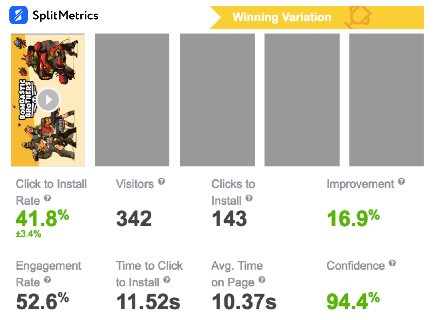
FFStudio experimented with app previews for their game Bombastic Brothers. The 15-second video became the winner showing 16,9% conversion uplift. All other variations exceeded the 20-second limit and had less impressive results. For example, the conversion improvement of the runner-up variation was more than two times worse compared to the winning one.
Your app previews should have a strong start focusing on the value proposition of the app or game without going into too much detail at the beginning. Your app preview can slow down a bit after but should still remain an “overview”.
Just like an ad in a Facebook feed, your App Preview can be skipped with just a scroll in the search results. And on the Product Page, you want to make a good first impression. So try to show something that embodies the value proposition of your app, and if possible something that is visually appealing.

Without going to the extreme, it’s best if this first part of the video doesn’t dive into details and instead gives a quick glance at the app.
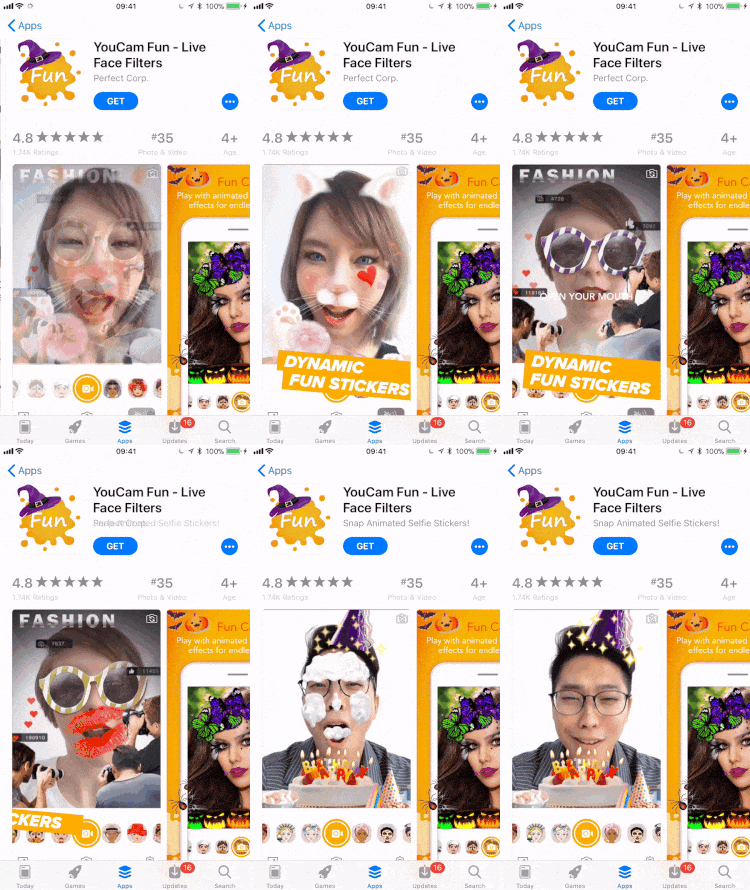
Using easily readable copy can also be a great way to have a strong start. You can find a good use of copy below. Never make it smaller than this.
If a publisher wants to uncover different sides of one application within their app preview, it makes sense to split features into several app previews 15-second each. In the majority 2 short app previews focusing on 2 different features win performing better than a couple of 30 seconds videos.
Store product pages with 3 app previews hardly ever win. We’ve seen 3 app previews outperforming 1 and 2 videos only once, but even then users didn’t watch them until the last seconds. It once again speaks in favor of 2 short and eloquent app previews.
For instance, Zimad A/B tested 3 variations and each had one, two and three app previews per page respectively. The page with two videos won with 11,5% conversion rate improvement.
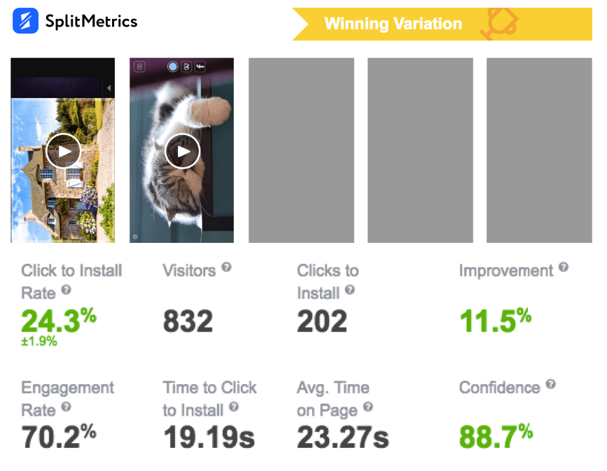
It’s curious that the control page with one app preview showed the second result while variation with 3 videos showed 9.3% decrease in conversion. It proved the trend we’ve mentioned above once again.
Don’t forget about a well-chosen poster frame that complements your screenshots set. It’s true that the videos autoplay diminishes the importance of the poster frame. But it doesn’t mean you should neglect it.
Try to think about your app preview frames and screenshots as a whole. The poster frame needs to be a frame of your video, so you should plan it at the same time as you plan your video preview.
The poster frame of the first App Preview will be displayed in the following cases:
– for a very short time before the App Preview starts playing in the search results on the App Store. But still enough time for most users to see it (try it yourself!);
– while the App Preview of the app below or above (competitors) is playing in the search results. For example, while the Candy Crush video plays, we see the Jelly Splash poster frame;
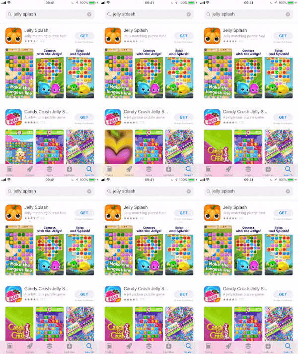
– before the App Preview video is fully visible on the Product Page;
– in India and China;
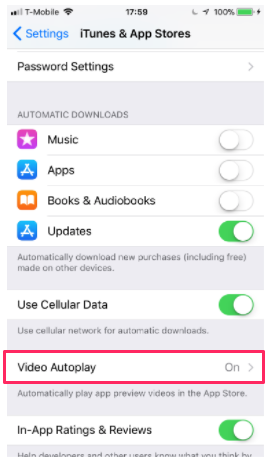
– for any users that have disabled autoplay in the settings.
It is better to avoid using landscape app previews on store product pages with portrait screenshots. In such cases, a video is placed in the Closer Look section which basically means that it has very little or no influence on CVR. However, it may make sense to use landscape app previews with portrait screenshots to increase TTR in Search and keep CVR on the app landing page unchanged.
Thus, you need to sort out your priorities before deciding on the orientation of your app preview:
Mind that a user should be able to perceive mute app videos in the preview mode. So make sure that all captions you use in your app preview are easy-to-read and all details are distinguishable.
All videos autoplay in the mute mode so don’t rely on narrative aspect of your audio. The footage of your app preview should speak for itself.
Know the guidelines and have a backup plan when experimenting in the “grey area”. It goes without saying that it’s essential to study Apple app preview guidelines carefully before getting down to your videos to avoid any problems in the course of product page reviewing:

Historically Apple’s guidelines have been pretty strict. It seems that Apple has loosened up a bit, and browsing the App Store it does not take long to find videos that would definitely have been rejected before.
Exploring the “border guidelines” can be interesting if it helps you better portray what your app is all about. But a review by Apple is still a manual process, which comes with subjectivity. So it’s almost impossible to know for sure what Apple will approve or not.
That’s why if you experiment with something (showing a live-action video behind a text screen, a short animation on a screen, special effects over your gameplay, etc.), you should plan it in a way that it won’t “break” your video in case Apple rejects it and you have to redo it.
Have a backup plan!
App previews should be aimed at covering the Attention stage of the A.I.D.A. model (stands for the terms Attention, Interest, Desire, and Action). So make attention-grabbing your main priority creating your app previews.
Only an intelligent approach brings significant results. It also may be sped up with experts assistance. That’s why we partnered with Apptamin and offer a special pack of up to 3 app previews and unlimited A/B tests so you can find the combinations that lead to a conversion uplift on the App Store and drive maximum installs.
Keep in mind that app previews don’t ensure a higher conversion on the app store page by default. However, app preview done right is definitely worth the investment.