App Growth Week · Join us for the 3-day virtual event!
Join for Free

Deep Town: Mining Idle Tycoon is a science-fiction strategy game made and published by Rockbite Games. In the game, you play as the main AI, with the key objectives being mining, crafting, and expanding the town while facing challenges and exploring the surrounding environment along the way.
Rockbite Games was aiming to increase the visibility and organic traffic of the game by at least 30%. As such, the Client chose the ASO Turnkey package in order to achieve that goal.
With SplitMetrics Agency and SplitMetrics’ A/B testing platform, Deep Town: Mining Idle Tycoon by Rockbite Games successfully made it into the TOP-10 in groups of relevant and high-volume search keywords and increased its visibility score across the board by as high as 49% as a result of us working together to optimize the text metadata of their App Store page.
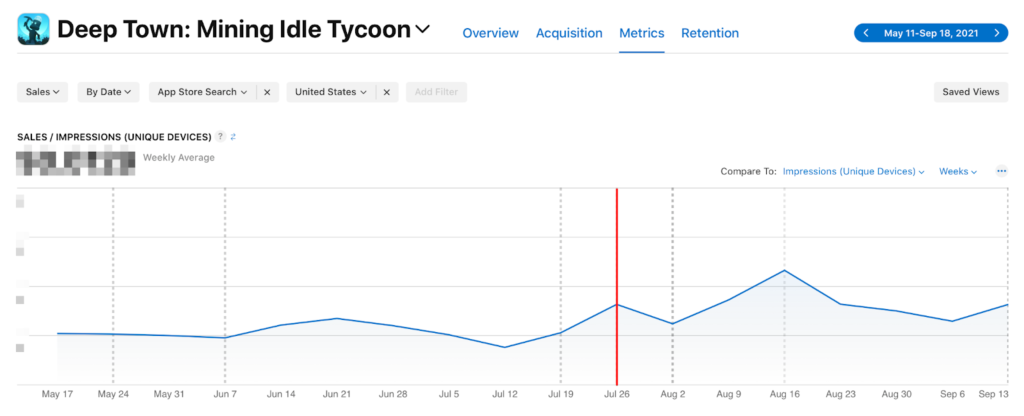
In addition to that, we managed to optimize the visual assets of the app’s page, which had a positive effect on the game’s CVR and reduced its CPI.
CVR increased by 20% to 23%. As a result of screenshots optimization, CPI from different sources has fallen by 30%.
To tackle this case, we first needed to analyze the multiple facets that make up the app’s presence in the store. Those include its marketing, target audience, benchmarks, internal game metrics, and, perhaps the most important factor, the competition surrounding it. Additionally, we conducted a detailed audit, the result of which was a well-thought-out plan of action.
In-game screenshots are an essential part of the product’s online presence. They convey action, showcase features and the gameplay the players will experience. Using SplitMetrics A/B Testing, we compiled 3 sets of screenshots and compared their engagement statistics to determine the best set.
1. Variation A was the original set of screenshots on the App Store page. It conveyed the game’s features quite well, but they were not visually distinct from each other. Not only that, but the amount of screenshots was excessive, which meant that the user would miss a big portion of information that described the purpose of the game due to the unnecessary extra swiping needed to access it.

2. Variation B was proposed by the Client based on our recommendations. This redesign brought crucial changes to the screenshots. For instance, a title image was introduced, which had been previously missing, and the information became more condensed, packing each screenshot with features that before were separated from each other.

3. Variation C was the result of our work. We refined the concept from top to bottom, introducing contrast and that distinct visual pop that defines so many examples of great marketing material, accentuating the game’s visual style and making it stand out from other apps in that category. Together, these visual elements work together to tell a story to the user, which describes a gameplay loop with objectives and the means to complete them.

After testing, the results concluded that Variation C achieved the highest conversion rate, with almost one third of all users downloading the app after looking at the screenshots as can be seen by the Click to Install Rate. Based on these data, the Client decided to update the app’s store page with the new visual assets.

When it comes to pushing a game such as Deep Town: Idle Mining Tycoon higher up the charts, it is crucial to pay attention to the text metadata of its App Store page. Thus, we decided to take a closer look at it in order to see whether we could make improvements to it to set the app apart from its competitors.
After conducting research in that area, we discovered that the keywords that were used were either oversaturated or low-volume in traffic, which made the game fall behind when it comes to organic installs. To solve the issue, we replaced them with less competitive search terms that are higher in frequency.
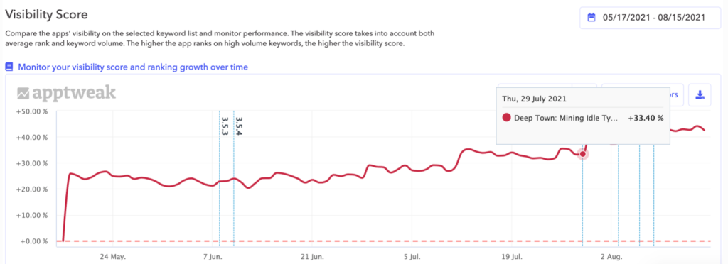
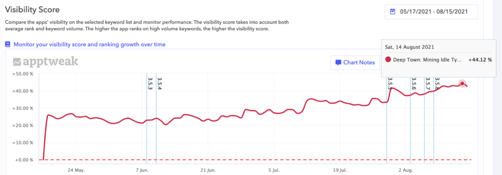
The updates to text metadata of the game were rolled out in the United States, Russia and Germany, with keywords curated for each region to achieve the best results. These are the outcomes based on the visibility score, which is based on average rank and keyword volume:


2. In the RU locale, the Visibility Score was raised by a staggering 40%, which meant that the game ranked high on the higher volume keywords, making it appear in more users’ search results.
3. The game reached its highest increase in Visibility Score in the DE region, with an incredible 49% rise in user interaction. This showcases exactly why optimizing text metadata is crucial to improving an app’s organic traffic.
After optimizing the app’s visual assets and metadata, the number of active users, and, consequently, paying users increased by 1,5 times compared to the pre-optimization data.


In addition to that, we have achieved multiple goals, which include the following:
We had the challenge of finding good visuals for the App Store. SplitMetrics made it possible to study user behavior in the Store and find appropriate creatives for it.