App Growth Week · Join us for the 3-day virtual event!
Join for Free

People prefer visual content over text. Applying this trend to app store optimization, it becomes crystal clear that publishers should pay close attention to such product page elements as app store screenshots, icons, etc. After all, app store screenshots take a great proportion of app’s page and get the best part of users’ attention.
Yet, how to turn your visuals into a converting machine? The internet offers loads of information on how you should design your icons and screenshots, but constant experiments of our clients prove that every game and app is individual.
That’s why it’s essential to make optimization for different markets an integral element of your ASO strategy.
Valeria who leads app store optimization in Zimad shares their case study on using app A/B testing for optimization of their app store screenshots for the Japanese culture.
Our testing ideas come out from the App Store design trends. We want to understand why our competitors and the top apps, in general, do what they do with app store screenshots, is that efficient and why.
We also try to use psychological patterns from the human behavioral studies in our visual design of app store screenshots to engage users in interaction with our app.
We understand clearly that the mentality differs a lot from country to country, especially for the Asian market.
People have different values and lifestyle experiences. Thus, we should do our best to deliver the message with our app store screenshots in the way that will resonate with the audience and won’t seem strange.
The optimization of app store screenshot for different cultures is crucial. It happens due to the fact that people react way better when they recognize familiar images within app store screenshots, something they see every day.
This process of recognition is called “processing fluency”. A brain tends to react faster on simple and accustomed images, generating a pleasant feeling, that in turn can convert into a download.

When optimizing your localized app store screenshots, the important part is to make sure that you also optimize your user acquisition interstitials accordingly.
In fact, even after setting a winning app store screenshots set in the actual store, you may have a loss of conversions just because your unoptimized interstitials attract a different audience. That was a mistake we made once and will never do again.
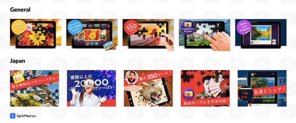
The hardest part was trying to “copy” Japanese style of app store screenshots. We made a lot of research on this, analyzed top Japanese apps, the performance of all our Japanese interstitials for different games to find some iterative pattern.
We found that native publishers in Japan often use lots of small elements in their app store screenshots, adding special effects and emotional captures all over the image.
For our European eye, it looks insane and the example with the processing fluency that I’ve mentioned above contradicts Japanese mentality.
When designing the Japanese app store screenshots for one of our games, it felt like it was not “Japanese” enough, so we were adding more and more cultural elements. The designer said he had never done anything that crazy before.
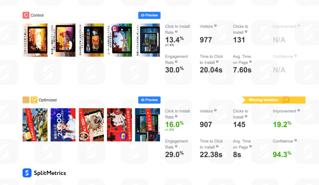
Before changing our app store screenshots, we ran two tests in Splitmetrics to make sure that the change won’t affect our current conversion rate in a negative way.
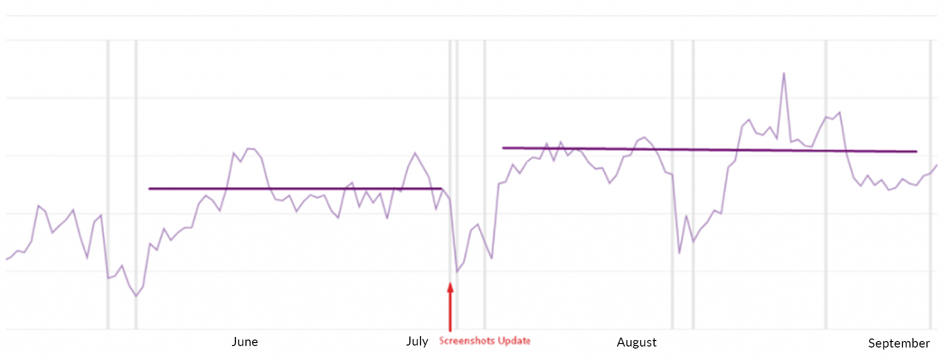
In the graphic below you can see how our conversion rate changed after we optimized our app product page for Japan.Optimization of app store screenshots with SplitMetrics resulted in 36% conversion rate increase.

And this is just a beginning as we are planning to make more tests for the Japanese region to understand its audience better and attract new users with the images on app store screenshots they’d love to see.
App A/B testing platforms such as SplitMetrics are a great option as it would take forever to test every set of app store screenshots in the real environment. It’s also very risky because you may lose current advantages.
We also noticed that if our new app store screenshots set wins a test with a little advantage (around 1% difference in the conversion rate), that wouldn’t guarantee the gain of conversion in the real environment. It may even result in the conversion rate decrease sometimes.
Before noticing it, we were surprised that we hadn’t seen any positive changes. So make sure that your winning set of app store screenshots overcomes the control one by at least 2% to get the real visible benefits.

Tapping variations of app store screenshots that finally give higher conversions becomes easier with every new A/B experiment. You analyze mistakes, A/B test, and repeat. Keep going until you have the results you are satisfied with.
We continue testing, even though I already see a huge increase in conversion rates. The next challenge for us is to overcome ourselves and break our own records.
As they say “There is no limit to perfection”, but everyone strives for it, so do we. We have a lot of interesting and unexpected ideas for app store screenshots and other assets that we’d like to test, and we’d love to surprise our potential users in a good way. I think it’s time to be more creative because people are tired seeing the same app store screenshots and icons over and over again.
A/B testing is an everlasting process. Even if you’re satisfied with the results, there’s always room for improvement.