Guide to App Store Screenshots in 2023: Sizes, Styles and ASO Best Practices
 Liza Knotko
 Liza Knotko
There are constant debates about the most impactful app store product page elements that help you grow app organically. Some growth hackers do believe that description really matters, some ASO specialists are assured that mobile icons beat all page elements when it comes to significance.
The latter assumption makes a lot of sense for Apple Search Ads and store search results conversion. However, when a user gets on the product page, screenshots tend to catch the best part of attention due to its visual nature and a large proportion of page space.
After all, it’s proven that less than 2% of users tap the “read more” button and some ignore app description entirely. It’s not surprising as visual communication has a better influence on people than written one and they, as a result, love to preview screenshots. Thus, app screenshots are responsible for grabbing the attention of potential users and argue them into installing an app.
There’s a considerable part of users whose perception of an app is primarily based on the quality of its screenshots and app reviews. What does it mean for app marketers? That screenshots optimization should be taken seriously.
To make sure you do it right, check that your screenshots answer the following questions:
Still, nobody will examine your screenshots to answer these questions if they’re not engaging enough. To perfect your screenshots and enhance your ASO efforts, you have to know everything about them from acceptable formats to design tricks. You’ll find all the necessary information in this ultimate guide which will take your screenshots knowledge to a pro level.
First things first, your screenshots are to meet the technical requirements if you want them to look professional and appealing. The principles are simple: the image must be JPEG or 24-bit PNG format with no alpha (transparency), either a 16:9 landscape or a 9:16 portrait. Actual sizes will depend on screen resolution of a specific device. Images can range from 320 to 3840 pixels, but have to stay within the 8-MB maximum file size limit. For your convenience, we’re going to list banner size requirements for the iOS devices in this section.
The number of screenshots on each store product page is limited to 5 images on the App Store. Don’t forget that if you add a video to your store page, its preview acts as the first screenshot getting a total number of them to 6. It’s important to remember the ‘Play’ sign in the process of video preview designing.
Here’s app store image size for screenshots summary for different Apple devices.
| Device | Device Size | Portrait Resolution | Landscape Resolution |
| iPhone 14 Pro Max | 6.7 inch | 1290 x 2796 px | 2796 x 1290 px |
| iPhone 14 Plus, iPhone 13 Pro Max, iPhone 12 Pro Max, iPhone 11 Pro Max, iPhone 11, iPhone XS Max, iPhone XR | 6.5 inch | 1284 x 2778 px 1242 x 2688 px | 2778 x 1284 px 2688 x 1242 px |
| iPhone 14 Pro | 6.1 inch | 1179 x 2556 px | 2556 x 1179 px |
| iPhone 14, iPhone 13 Pro, iPhone 13, iPhone 13 mini, iPhone 12 Pro,iPhone 12, iPhone 12 mini, iPhone 11 Pro, iPhone XS, iPhone X | 5.8 inch | 1170 x 2532 px 1125 x 2436 px 1080 x 2340 px | 2532 x 1170 px 2436 x 1125 px 2340 x 1080 px |
| iPhone 8 Plus, iPhone 7 Plus, iPhone 6s Plus | 5.5 inch | 1242 x 2208 px | 2208 x 1242 px |
| iPhone SE (3rd gen & 2nd gen), iPhone 8, iPhone 7, iPhone 6s, iPhone 6 | 4.7 inch | 750 x 1334 px | 1334 x 750 px |
| iPhone SE (1st gen) | 4 inch | 640 x 1096 px (without status bar) 640 x 1136 px (with status bar) | 1136 x 600 px (without status bar) 1136 x 640 px (with status bar) |
| iPhone 4s | 3.5 inch | 640 x 920 px (without status bar) 640 x 960 px (with status bar) | 960 x 600 px (without status bar) 960 x 640 px (with status bar) |
| Device | Device Size | Portrait Resolution | Landscape Resolution |
| iPad Pro (4th gen, 3rd gen, 2nd gen) | 12.9 inch | 2048 x 2732 px | 2732 x 2048 px |
| iPad Pro, iPad Air (5th gen, 4th gen), iPad mini (6th gen) | 11 inch | 1488 x 2266 px 1668 x 2388 px 1640 x 2360 px | 2266 x 1488 px 2388 x 1668 px 2360 x 1640 px |
| iPad (9th gen, 8th gen, 7th gen),iPad Pro, iPad Air | 10.5 inch | 1668 x 2224 px | 2224 x 1668 px |
| iPad, iPad mini | 9.7 inch | 1536 x 2008 px (without status bar) 1536 x 2048 px (with status bar) 768 x 1004 px (without status bar) 768 x 1024 px (with status bar) | 2048 x 1496 px (without status bar) 2048 x 1536 px (with status bar) 1024 x 748 px (without status bar) 1024 x 768 px (with status bar) |
| Device | Screenshot Size |
| Apple Watch Ultra | 410 x 502 px |
| Apple Watch Series 8, Series 7 | 396 x 484 px |
| Apple Watch Series 6, Series 5, Series 4, and SE | 368 x 448 px |
| Apple Watch Series 3 | 312 x 390 px |
Not so long ago app publishers had to upload screenshots of various sizes matching different iPhone models. It was a tedious and boring work, but there was no other way.
However, everything changed. Now it’s possible to upload screenshots for the screen of iPhone 7 Plus and the system will adjust screenshots to sizes of all other iPhone generations automatically.
Android phones
Format: .png
Minimum dimension: 320 px Maximum dimension: 3840 px
Android tablets
Format: .png
Minimum dimension: 320 px Maximum dimension: 3840 px
As for the file format, the App Store accepts PNG and JPEG files. It’s vital to upload files of the best possible quality within accepted resolutions, you can check out iTunes Connect Developer Guide for more details. By following these simple requirements, you’ll have no problem submitting your app.
Choosing between portrait and landscape screenshots is a common ASO dilemma app marketers face. Some publishers end up submitting horizontal screenshots as vertical ones forgetting about users’ convenience, so it’s not the best option.
In general, it’s recommended to stick to portrait orientation if possible, as such screenshots are easier to scan quickly and a user can see 3 screenshots without further scrolling.
Nevertheless, landscape orientation holds leading positions in the gaming segment. The thing is that gamers are used to horizontal screen orientation and it doesn’t scare them away once encountered on the App Store.
However, this ASO formula doesn’t work for all sort of games.
For instance, Rovio tested portrait screenshots vs landscape ones before launching Angry Birds 2. The results contradicted the gaming industry trend as vertical screenshots won. It turned out that Angry Birds users don’t belong to hardcore gamers group and are not used to horizontal screenshots orientation on app stores. In the process of screenshots optimization with mobile A/B testing, the app got a 13% conversion increase which means millions of additional installs in absolute figures. Thus, the game got 2.5M more new users in just a week after its launch.
Read also: Angry Birds 2 by Rovio: 2.5M more installs in just a week with ASO and A/B testing
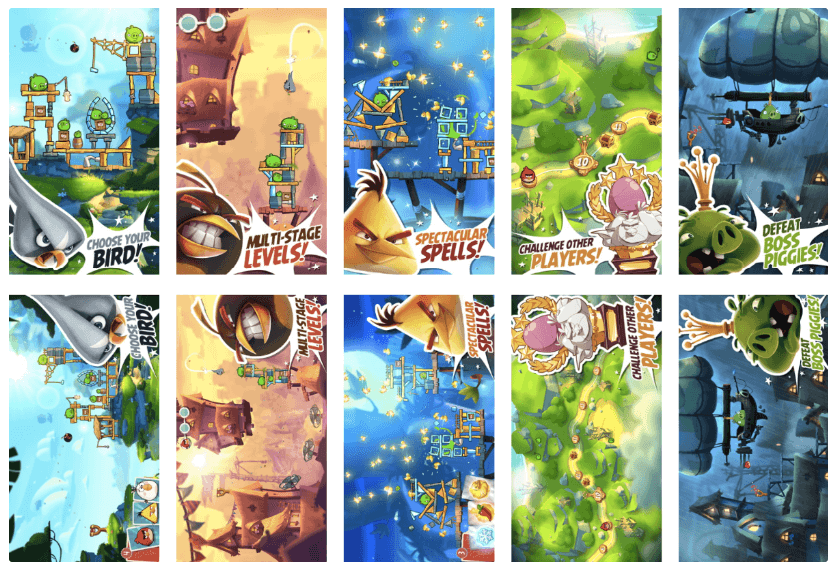
That’s why it’s essential to A/B test different orientations along with other product page elements despite overall vertical screenshots dominance. Who knows, your app’s conversion might skyrocket thanks to an uncommon mixed type which contains both portrait and landscape screenshots
Learn all the latest App Store Optimization trends for screenshots (colors, styles, best ideas for art, orientation) in the App Store and Google Play Store in “ASO Benchmarks & Trends 2020. Mobile Games.”
It all depends on your app style. Sure, you’re not restricted to the same color palette used in your app design. However, it’s good to start with it as it’s an easy yet effective way of delivering your app’s spirit. If your app is playful, the screenshots should reflect it, for example, via using vibrant custom colors for every screenshot. Minimalistic nature of an app can be applied to your app screenshots color layout.

Here’re a few ASO tips concerning colors used in screenshots layouts:
Soundly elaborated background in its turn can help draw users attention and emphasize app’s usage context, clarifying app’s features. It’s also a good idea to research background images your target audience likes the most.
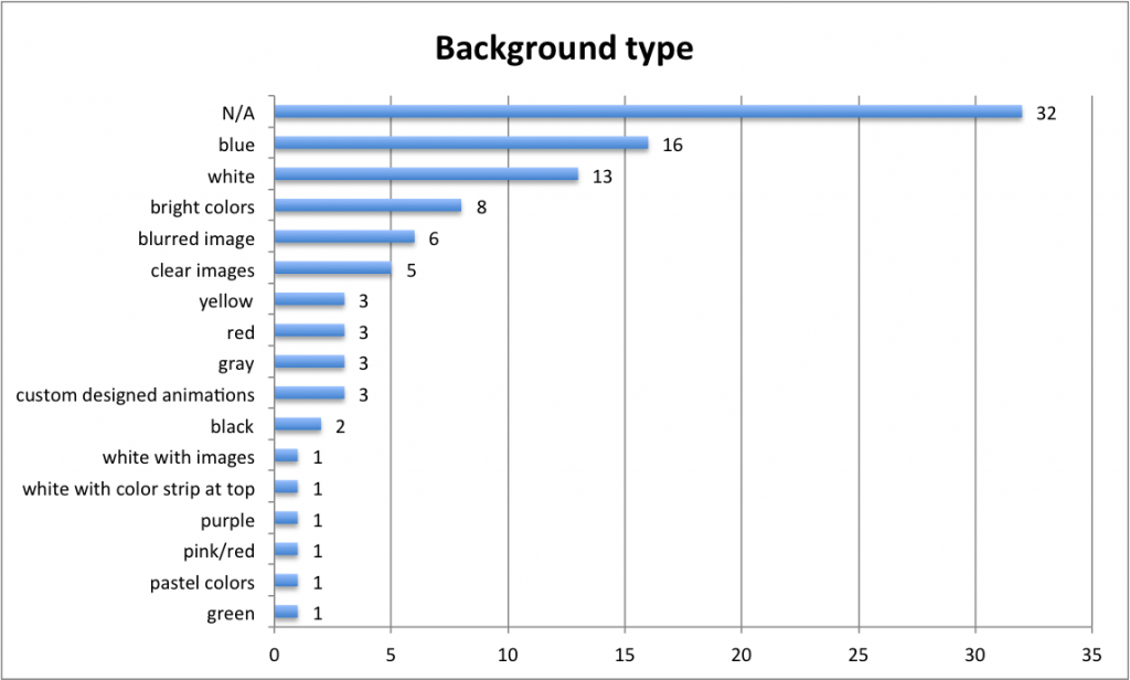
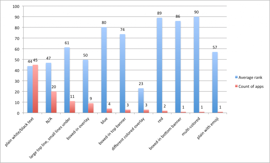
Incipia studied product pages of top 100 free apps in the Apple App Store and got the following results:
A distinct ASO trend has emerged lately: app publishers prefer to add a short descriptive text reducing illustrations in image size. However, it’s important not to overdo, a caption shouldn’t exceed two lines.
Adding caption makes no sense unless it’s easy-to-read, short, and clear. The truth is app store visitors don’t open full-screen gallery normally, so it’s important to make fonts bold and readable even from product page thumbnails of screenshots. Usage of call-to-actions is encouraged, app’s features are to be emphasized with verbs.
Short action-packed captions were used in the optimization of SongPop2 trivia game. For example, a brief verb-packed caption “LISTEN, GUESS, AND COMPETE” replaced extended “The addictive trivia game featuring real music”. The app obtained 10% better CVR as a result.

Incipia found out what type of captions prevail in top apps in their study. The majority of apps used a plain white or black text. Captions in screenshots of game apps took a certain shape, box or banner on top or bottom of the image as a rule.
It turned out that keywords don’t make any difference in terms of your ASO efforts, so it doesn’t really matter whether you use them in your captions. In general, apps with some sort of caption had better ranking compared to ones without any text on screenshots.
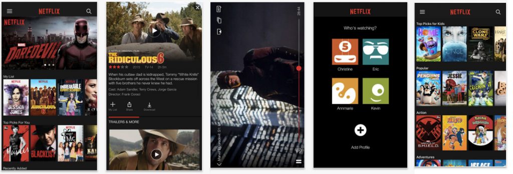
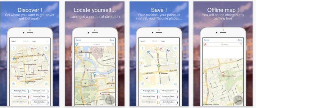
They basically depicture in-app screenshots without any additional edits, redesigns or improvers.
It’s not the best way to promote a new app. Normally, app store users find it boring and not engaging. However, some publishers make even such straightforward screenshots look appealing and stylish.
Pros:
Cons:
How to do it:
Capture your app interface at the most engaging moments
Who can use it:
App developers who need screenshots asap. This type of screenshots is mostly used by game and fitness app publishers as screenshots of these kinds of apps can show instant value.
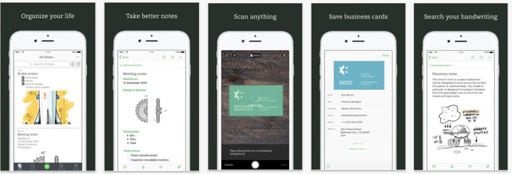
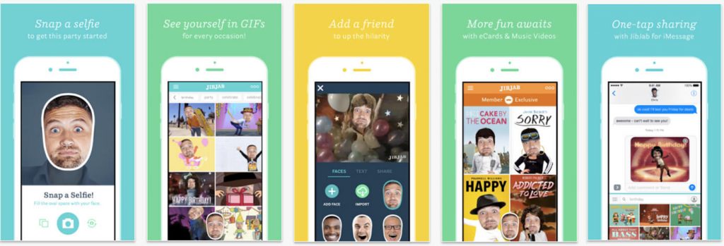
The idea is pretty simple: an app publisher chooses a background template, places the device in the center, and adds a caption above or under the device.
Mind that background color may vary. Lots of online screenshot builders provide such a design, so this sort of layout is quite popular on the app store.
Pros:
Cons:
How to do it:
There’re plenty of online screenshot builders (AppInstitute, AppLaunchpad, etc.) which have such templates.
Who uses it:
App developers on a tight schedule who don’t have an in-house designer. This style can be used for all store categories.
It’s similar to the previous one except for the fact that the blurred photo is used as the background making an image more integral and stylish. This screenshots type gained popularity among cooking and photo editing app categories.
Pros:
Cons:
How to do it:
Free versions of online screenshot builders can help you with the creation of such screenshots.
Who uses it:
App developers on a tight schedule who don’t have a time or desire to create a unique set of screenshots. This style is particularly popular among cooking and photo editing apps.
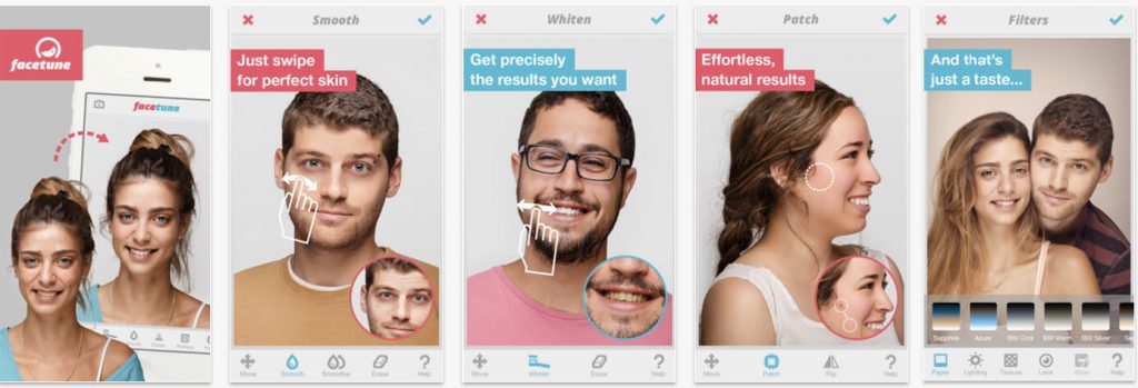
A set of screenshots in such style normally represents a tutorial on using the app. It’s recommended to use this style if your app encourages a user to interact with their device in a new and unusual manner.
Once you decided to apply such style to your screenshots, make sure all instructions are concise and laconic.
Pros:
Cons:
How to do it:
Pick features you want to deconstruct carefully. Remember that your instructions are to be as laconic as possible.
Who uses it:
Use this style solely if your app requires a user to interact with their device in a new and unusual way. There’s no need to use it when customers already know how to work with this type of apps.
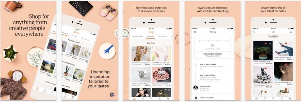
Sets of ‘connected’ screenshots were extremely popular a couple of years ago. This type presupposes that each screenshot is the beginning of the next one. Indeed, when you do it right, this style can be really engaging and eye-catching. Nevertheless, it’s not that easy to nail it. There’s a threat of making your screenshots confusing and illegible.
Nevertheless, it’s not that easy to nail it. There’s a threat of making your screenshots confusing and illegible.
Pros:
Cons:
How to do it:
It’s better to charge professional designers with this task, as it’s pretty hard to get it right.
Who uses it:
This style can be used for an app in every category, it’s especially popular among video streaming and music apps.
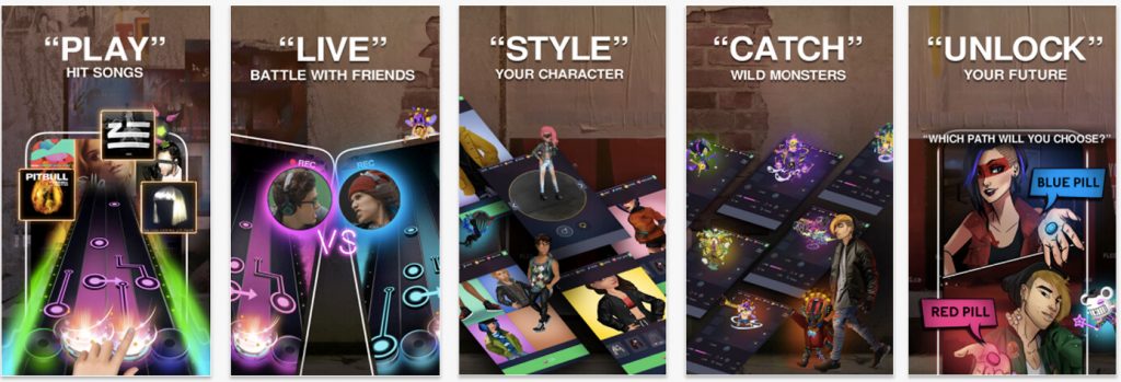
The splash screen screenshots look like an ad which demonstrates app’s features and explains its purpose. Visuals used in such screenshots are not part of an app as a rule. The first screenshot usually conveys a principal message of your app.
Such an approach can help your app stand in the crowd of categories crowded with screenshots depicting mobile devices.
Pros:
Cons:
How to do it:
No screenshot builder will help you with this style, you have to think over all details before getting down to design itself. Charge your in-house or freelance designer with this task.
Who uses it:
Once done right, any app product page can benefit from it. It’s extremely popular to use this style in the first screenshot for gaming apps.
This style helps app store visitors to see your app in a real-life setting. It’s a great way of showing your potential customers what you’re offering. Yet, there are lots of cases when photo-like surroundings steal the scene from your app. Be careful using this screenshots type.
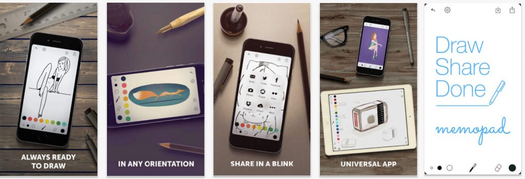
Pros:
Cons:
How to do it:
Choose photos that resonate with your potential users and reflects the app’s spirit. Try to integrate photo smoothly into your screenshot.
Who uses it:
If a professional designer is available to you, there are no restrictions concerning this app store screenshots style.
As it comes from the title, this style presupposes combination of two or more screenshot types. You can experiment with various layouts. There’s no need to stick to one option. Play around different screenshots styles and find out which variants resonate with your audience.
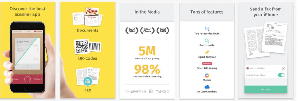
Pros:
Cons:
How to do it:
Think carefully what styles you want to combine, how they’ll highlight your app’s main features. Don’t be too drawn away with design questions, remember that your main goal is to tell users as much as possible about your app and make them install it.
Who uses it:
This style is applicable to screenshots of any app.
Many app publishers don’t realize how dangerous it is to underestimate localization impact on the app’s performance. It’s highly important to remember that it’s not enough to merely translate your screenshots captions. Localization is to happen beyond the text. After all, you’re adapting to another culture.
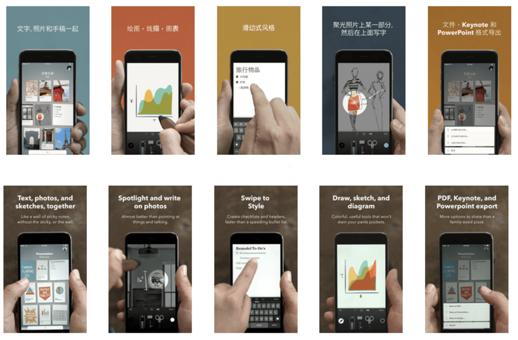
For example, FiftyThree managed to get a 33% conversion increase localizing their Paper app for the Chinese-speaking market. As a result, the English version of screenshots differs dramatically from the Chinese one. It turned out that a multicolored background works way better than a monochrome one on the Asian market.
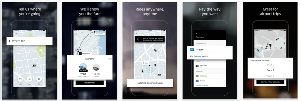
Devil is in details when it comes to localization. Uber nails details with its product pages for different locales. It seems that the screenshots were just translated but they were truly optimized. On app store versions for the US and Japan, we see various maps, destinations, currencies, etc.
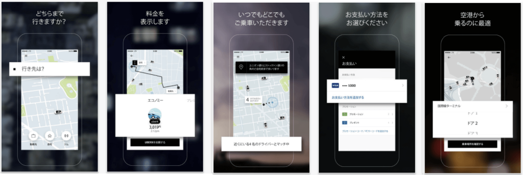
Localizing screenshots you make your app more appealing for representatives of different cultures, thus enlarging your customer bases immensely. So, you’d better take it seriously, it wouldn’t hurt to consult professional translator and ask a native speaker to double-check renewed localized screenshots.
First two screenshots have to be as engaging and informative as possible without hurting the ease of comprehension. App store visitors should get the core message of your app straight away.
If you want to give extra ASO power to your images, choose the most popular feature of your app for the first screenshots based on insights about users’ in-app behavior.
