App Growth Week · Join us for the 3-day virtual event!
Join for Free

Ciliz is a game development company that builds games for social networks and mobile platforms. Ciliz’s most popular product — Spin the Bottle — a casual dating app that is visited by 1 million users daily.
The Ciliz Team works on continuous optimization of the “Spin the Bottle” app, looking for growth points and new details that will bring in innovation and efficiency. That’s why Ciliz requested SplitMetrics Agency to streamline and coordinate the optimization process for their app, carry out analysis, develop and prove hypotheses, which will increase conversion.
SplitMetrics Agency’s Team analyzed the app store product page of Spin the Bottle, and proposed a few hypotheses that were related to optimizing the app’s icon.
The first idea behind the optimization of the icon (and one of the key hypotheses) was the transition from drawn elements to real people that would occupy the most part of the icon. According to SplitMetrics’ data, more realistic positioning on visual assets helps to keep the app store page more aligned with the app’s topic, stand out from competitors, and convey the key idea of the app.
Then SplitMetrics Agency suggested another hypothesis: to check whether the upgrade of the current icon’s version might improve the conversion rate. The upgrade involved adding a “New”* sticker to the icon, enlarging some elements on the icon, choosing more vivid colors and reflecting game mechanics.
*Note: Before adding similar stickers on the Google Play Store, read the latest guidelines.
The following icon variations were developed by SplitMetrics Agency’s Team:

Then the Agency launched an A/B testing experiment on the SplitMetrics platform in order to check the hypotheses and identify the variation that performs best.
Based on the results of the experiment, SplitMetrics Agency’s experts decided to replace the current Client’s icon in the app store with the new option — variation A.
This variation performed best during the mobile A/B testing experiment, since it reflects the game mechanics and conveys the idea for potential users, and also, immediately attracts attention with a sticker, as well as contrasting & salient colors.
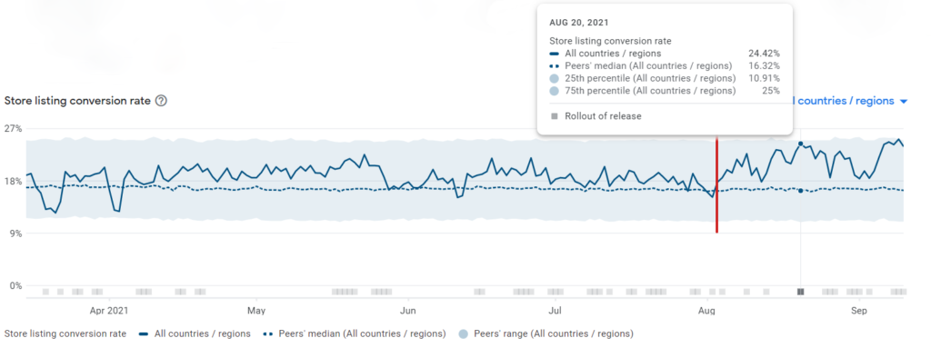
The icon was replaced with the new version, and soon the conversion rate growth was spotted, which is illustrated in the graphs below.

On this graph, you can see the store listing conversion rate for Spin the Bottle 30 days before the icon update on August 6 and 30 days after.
And the second graph demonstrates store listing conversion rate for the 180-day period March 17 – September 10 (180 days). User engagement increased significantly.

As can be seen, the conversion rate for Spin the Bottle increased from 20.46% to 24.42% after optimization events implemented by SplitMetrics Agency. The 3.96% difference means a 19.4% increase of conversion since the icon was replaced.
Thanks to the streamlined optimization process, hypotheses suggested by SplitMetrics Agency and multiple metrics introduced in the SplitMetrics A/B testing platform, allowing to track performance of specific variations, Spin the Bottle by Ciliz gained a 19.4% increase in conversion.
SplitMetrics Agency helped us systematize the ASO hypotheses testing process, generate ideas and apply some of the hypotheses after testing to our real app store product page, with subsequent conversion improvement.