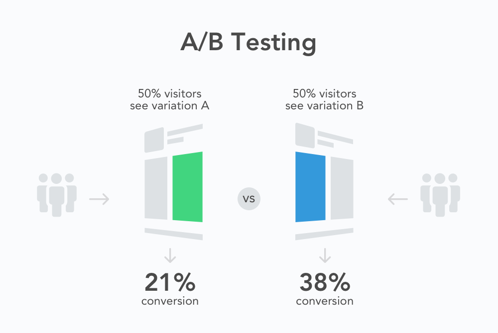
A/B testing (often referred to as split testing or bucket testing) is a means of comparing two options and analyzing results. It can be used to test, compare, and analyze just about anything. It is most often associated with websites and recently, mobile apps; A/B testing is primarily used for conversion rate optimization. Online businesses regularly optimize their landing pages and improve ROI through the help of A/B testing.
Every test begins with the formation of the hypothesis. The classic example of this might be ‘Sign Up’ vs. ‘Register’ links or ‘Red’ vs. ‘Green’ buttons. Once the goal (e.g. installs) and options for the test are determined, the tester starts driving users to the pages. All user traffic is randomly distributed between the control version and the other variations. Visitors should be unaware of their participation in the experiment. If one variant performs significantly better than the others, it can be considered as a winner and should be applied.
You’ll see it being used to compare smaller elements such as styles of call-to-action buttons and larger components as well like the site’s overall design. However, A/B testing works just as well, if not better, for mobile apps. Often overlooked by mobile developers, this tool may be used to determine the effectiveness of icons, screenshots, descriptions, store search results, directions, prices, headlines, and more.
This excellent, data-based method for testing marketing strategies is typically rolled out over a period of a few days to a couple of weeks. It’s also important to ensure that there are enough users to generate accurate results.
Ready to start A/B testing?
Follow the strategy outlined below to begin A/B testing:
Determine your objective. Whatever you’re testing should lead to a greater goal such as higher conversion rates. Ideally, A/B testing will help you solve an issue with your app and drive your business goals to success.
What is it that you want to compare? Identify a problem you’d like to solve. It may be an element of design, copy, or function.
E.g. What’s more important to your users: free shipping or $15 off of their first order? Which screenshot orientation will generate more installs for a game app: portrait or landscape? Which app icon style is more eye-catching: multi-colored or monochromatic? You can easily find out with an A/B test.
Once you’ve formulated your theory and identified the element that you want to A/B test, you need to create two variations of the landing page. (Let’s call them A and B.) They should be exactly the same, the only difference being the element that you want to test (icon, screenshot, description, etc.)
Once you have the two pages ready, you need to identify your audience and drive them to these pages (directing 50% of visitors to page A and the other 50% to page B). You then measure how many installs each version generates to determine the winner. The easiest way to do all of the above is run a split test with SplitMetrics. It lets you quickly create variations pages that replicate the App Storу or Google Play and drive traffic to them from your website/apps, Facebook ads or other ad networks SplitMetrics collects all of the analytical data, tells you which variation won and gives you a comprehensive report on how users interacted with your app page.
Make sure you have enough users to achieve significant results; it isn’t wise to make major changes to your app based on the results of a small number of users. Once you have driven enough visitors to your experiment, its results are deemed to have a high confidence level or in other words, the chance to beat the control for your variation is either high or low.
Here’s the fun part: determining the winner! There’s a number of factors to consider including: time on page, interactions with different elements of your app’s page (screenshots, descriptions, etc.), scroll depth and more. But ultimately you should be looking at how many people tap the ‘Install’ button as this is your top goal.
Remember, if you find little to no difference, you can always change your variants and run a new test.
If you do have a clear cut winner, go ahead and start making changes based on the results you’ve generated. In the case of testing the app icon, you would now update the design to reflect the winner of your A/B test. If a higher price yields more revenue, then you can consider updating your pricing.
A/B testing does not exist in a vacuum, and it’s hardly ever a one and done deal. Conversion optimization is an ongoing process with no ending. Always run experiments to determine how you can further improve your conversion rates and boost your bottom line.
Currently, the app stores either lack a means of A/B testing (like Apple App Store) or offer limited functionality (as with Google Play Experiments), despite the fact this strategy is paramount to identifying what really increases your sales (and what’s a waste of time and money).
So, you’ll need to use a solution designed with mobile developers in mind. SplitMetrics makes running A/B tests and figuring out what’s really working easy.
The benefits for mobile developers are nearly endless, but some of the highlights include:
Bottom line: A/B testing is the perfect tool as it allows all developers to identify room for growth in their apps’ landing pages, make significant improvements based on the results, and of course, understand their users’ behavior. The insights are there for the taking and make determining what’s right for your app a breeze.